Pepsi Homepage
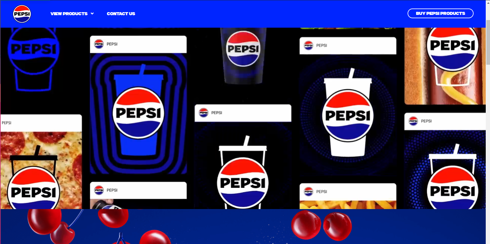
The Pepsi homepage shows it's strengths in the repitition and contrast elements of the principals of visual design. The deep blues and reds, and flashy animations are very striking. The heavy use of images and animations may be a little too distracting. This website is not very simplistic.
- Navigation options in the menu and on the page are clear, visible, and scannable
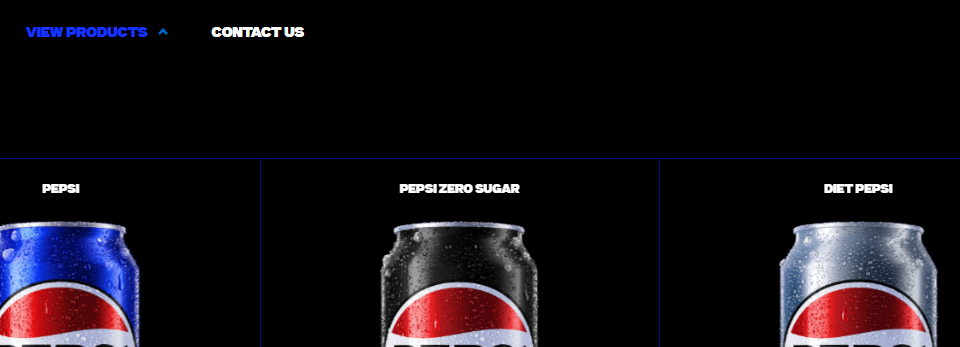
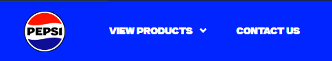
- The Pepsi nav menu is not a real nav menu. It only displays "view products" and "contact". it is nice to see the contact at the top.

- Users can easily return to the home page or relevant starting point and can easily exit from all pages
- The Pepsi logo in the top left corner persists through the webpages and can be clicked to return to the main page
- The destination of navigation links is predictable (delivers the visitor to the promised content on the correct page)
- The Pepsi navigation links work as intended and bring the user to the products, or contacts portion of the website.
- Each page has a clear title related to other labels around it
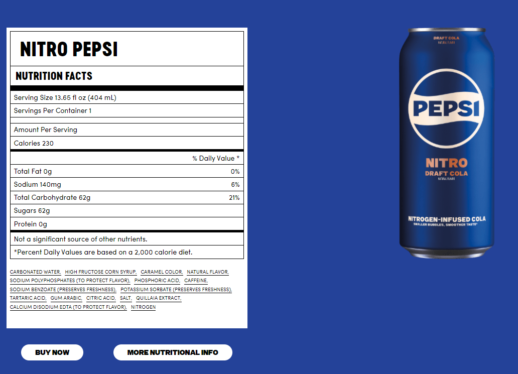
- The Pepsi products page does not have clear titles for each one of it's products at the top of the page, instead it lists the names above the nutritional information.
- Contact information has a clear path to it website-wide
- The contact information in the navigation menu is obvious at the top of the page.
- Calls to action (e.g. register, apply, submit, add to basket) are clear, well labeled, and appear clickable
- The CTA on the homepage is clearly displayed on the top right hand corner of the page

- Sugestions for Improvement:
- Adding more to the navigation menu seems like a obvious improvement. Show some other interests of the brand instead of just a list of products
- I love the flashy animations and large picture areas, but it may be too busy. Also, you have to scroll down quite far to access some content that should be higher up
- After you click the CTA button, the webpage takes a long time to load, and when it does, it looks very dated.
Coca-Cola Homepage
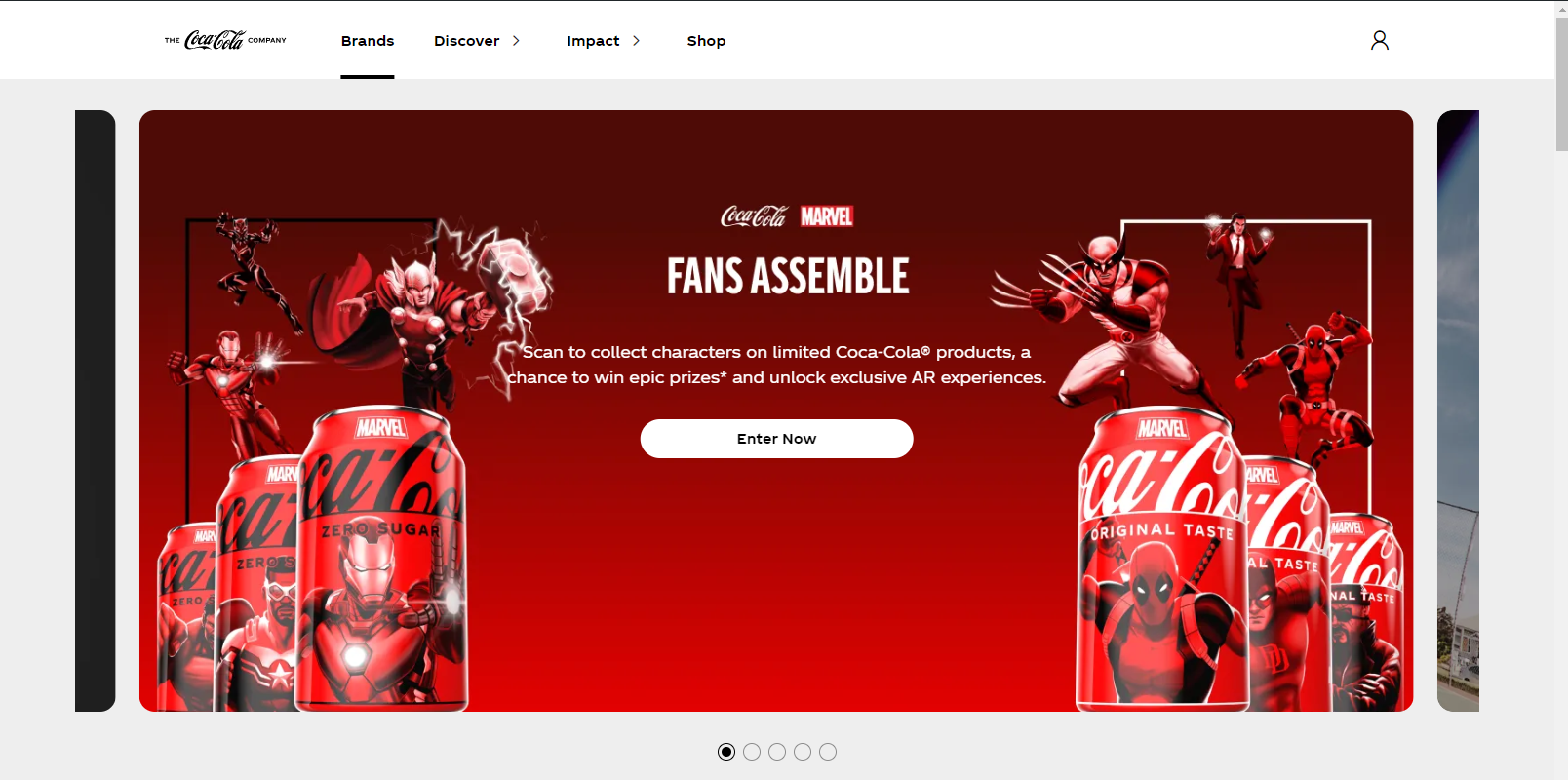

The Coca-Cola webpage is much more simplistic in it's design and makes good use of its alignment. the visual elements are spread out nicely, and it is much less focused on drawing attention.
- Navigation options in the menu and on the page are clear, visible, and scannable
- The Coca-Cola nav menu offers more options to navigate the site than the Pepsi page.

- Users can easily return to the home page or relevant starting point and can easily exit from all pages
- The logo in the top right hand corner of the page returns the user to the main page and persists on every page.

- The destination of navigation links is predictable (delivers the visitor to the promised content on the correct page)
- The links on the Coke webpage all work and all show relevant content.
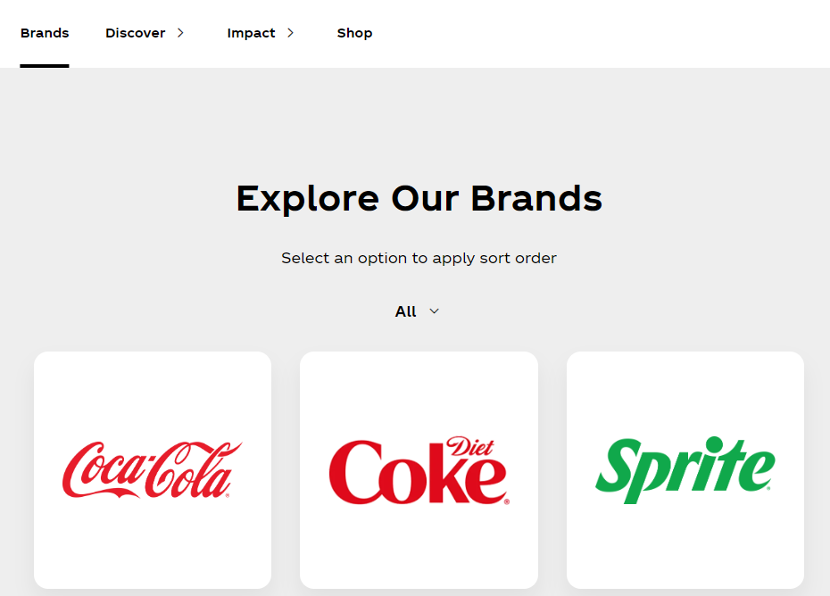
- Each page has a clear title related to other labels around it
- Each page visited has a title beneath the navigation menu to show which part of the site the user is on
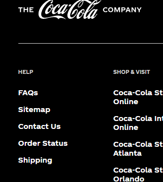
- Contact information has a clear path to it website-wide
- The contact information is located at the bottom of the page instead of the top, like Pepsi. This is a more traditional format.
- Calls to action (e.g. register, apply, submit, add to basket) are clear, well labeled, and appear clickable
- The CTA on the coke website is just a profile login button on the top left hand corner, it is not as clear as the Pepsi CTA.
The "Shop" button in the nav menu may also be considered a CTA

-
Suggestions for Improvement:
- The Coca-Cola homepage is boring compared to the Pepsi homepage, not very colorful or exciting
- The branding seems to not be focused on Coca-Cola, and is more of a entry point to all their brands.
- Outside of these two factors, the Coca-Cola website is better than the Pepsi website